onsdag den 23. april 2014

CPHPIX day 14: Rio 2096 - A Story of Love and Fury, Rio Belongs to us, Tom at the Farm

So I skipped day 13. Because I'm superstitious. And also because I had to move into a new apartment. So these are my final reviews from the festival this year. It's been a great year for me. Some masterpieces in the program, and I think I've been better at wheedling out the boring stuff, and focus on something that at least had some resemblance of interest to me. Even the stuff I didn't really like - and there's one more of those coming today - I'm still happy that I saw.

Rio 2096 - A Story of Love and Fury (Luiz Bolognesi, Brazil, 2013)


I'm impressed at how this film got made, how it got funding. Because, boy, is this an angry film. Four stories about Brazil, three from the past, one from the future. I get why it's animated, because a live-action version of this film would have been so immensely epic and expensive, that all the critique would undoubtedly have been removed.

Still, I'm impressed by the fury of this film. Granted, Brazilian history invites itself to this kind of fury. We follow an immortal warrior named Abeguar through four time periods, where he is constantly battling for the underdog, and always in love with a new woman named Janaína. He is an Indian fighting the Portuguese, a Mestizo leading an uprising against the Empire of Brazil, a student fighting the dictatorship, and finally, joining a group of terrorists in the future fighting a water-conglomerate for the right to water for everyone. We watch people being massacred and tortured, bodies being roasted and eaten, children getting raped and shot. It's all a bit much. But I don't think it's superfluous or that ahistorical. The indians were almost wiped out. The rebellion is based on the Balaida-rebellion - named because on of the main instigators made baskets or 'balaios', like the warrior in the film - which was crushed like so many other internal rebellions by Luís Alves de Lima e Silva, nicknamed both The Iron Duke and The Peacemaker. The segment set under the dictatorship is twofold, first when Abeguar fights along with other bourgoise students, and then after he is released from jail with him moving into the favelas to fight with the poor. The theme of the need to fight against opression is stated more nuanced than it often is. Because they always fight, and they always lose, and they take bystanders down with them. After being released from jail, the students, including Janaína, manage to go back into a middleclass life, while the poor become even more left out and hidden in the favelas. The sci-fi part suffers from what so many sci-fi's suffer from in being less clever than it seems to think it is - I guess it's mainly about the importance of keeping natural resources under control by the people. Like Petrobras.

So the fury is all well and good. But the part about love is a bit pat. At times, it mainly seems like Abeguar loves Janaínia because of her name, and because she whistles so prettily at him when he is disguised as a bird. Of the four stories, only the fourth really revolve around love as a major part. Here Abeguar has sorta given up, and is happy to buy the love from Janaína, who now is a high-class prostiture, I guess. But once she makes her move against the regime, he changes his mind. I like that it switches the gendered view of who is a fighter and who is fought for at the end. Also, the animation isn't really that impressive. The future society is impressively designed, but there is a dearth of really well-designed pictures, and the movements are mainly choppy. And really, I've seen reviewers talk up the amount of violence and sex in this cartoon, and while it's unusual for a cartoon, that it's all animated does serve to lessen the impact of it all. It's violent for an animated film, but for a violent film, it's pretty easy to sit through. And I'm not sure if that was the point. The film seems to want to be a call for action, but I'm uncertain if it works like that. It's a fine primer on Brazilian history, though, which I'd recommend diving into since we're all going to hear a lot about the country once the World Cup begins.

Rio Belongs to Us (Ricardo Pretti, Brazil, 2013)


After having been so pleasantly surprised by Road to Ythaca, I checked the program and found out that there was a showing of another film by one of the four directors. They're all part of a group called Alumbramento, who helps each other with making films, in an underground and independent fashion. This has really been my big surprise this festival, far from being the best films, but these two films had a sense of independence, of willing to be different, and an energy to them, which was quite frankly refreshing. I've liked most of what I've seen, but there is a sort of sameness to a lot of second-tier arthouse filmmaking, a European inspired tasteful aesthetic with long takes, but not too long, diffuse plots, but not too diffuse, pretty pictures, etc. This still had long takes, a diffuse plot and some quite pretty pictures, but it left the world of tastefulness far behind in favour of cheap and brassy pretentiousness.

Oh yes, this was pretentious as hell. I think most of the theater was annoyed at that, and quite frankly, if I'd payed full price for the ticket, I'd might have been as well. But I really liked it. We begin with a black screen and clanging noises, then cut to two naked people in a post-coital embrace. Hold it a long time. Part of the film was in English for no apparant reason, and the toneless and weird delivery makes me think the actors didn't really understand what they were saying. Most of the film took place in empty rooms, mainly filled by matresses and naked lightbulbs. The barebones plot has Marina receiving some very weird messages saying 'Rio Belongs to Us', but mainly the film was a moodpiece, a collection of dreams and weird dialogues.

And I liked it a lot. It drew a lot on horror, with the weird messages and all the empty rooms. There is even a scene where Marina walks on a beach in the weird and unnerving way like the ghost from The Ring. It was quite effective at that. But mostly, I loved the space it created. All those empty rooms. In one scene Marina is in a darkened room, and removes taped-up newspaper from a window, all of a sudden creating a portal to the world outside. The film showed Rio de Janeiro in a way I've never seen it before, showing empty concrete high-rises against the treefilled mountains surrounding it, and focusing quite a lot on the river. It felt as if nature was collapsing in on the city, as if it was a concrete maze fenced in by rock, water, tree and cloudfilled sky. I've never been to Rio de Janeiro, but I'm pretty certain that is not what the city is like. However, that is one of the great thing about cinema, the way a filmmaker can turn his surroundings into a personal vision. And the city of Rio Belongs to Us was one of the best cities I'd seen at the festival.

Tom at the Farm (Xavier Dolan, 2013, Canada)


Xavier Dolan is the wunderkind of arthouse cinema. 25 years old, and his fifth feature has just been chosen for competition at Cannes. This one, his fourth, was at Venice, where it won the FIPRESCI prize. Also, he's a famous voice-actor in Quebec, haven't dubbed roles such as Ron Weasley, Brainy Smurf and Jacob from Twilight. I guess we might very well be stuck with him for a looong time, so though I don't think his films seem that interesting, I decided to check this out. And I don't get it. It isn't bad, not at all. Well made, beautiful, tense and suspenseful. But also a bit dull, and not really amounting to much.

The film is an adaptation of a play with the same name. It follows Tom as he travels to a farm for the funeral for his lover Guillaume. Guillaume's brother Francis forces him to keep it a secret that Guillaume was gay, and then it all becomes fucked up and thriller-like. There was a lot of stuff I liked: An impromptu tango-dance, an ominous shot of a dead cow being dragged behind a tractor, a scene where Tom comes running out of the stable with blood on his hand, and we think he has taken part in a slaughter of a cow, but then learns he helped a cow give birth instead. And Dolan captures the northen lights with the long shadows quite well. The first few times we see Francis, his face is hidden from us as well as Tom, and when he then violently wakes Tom up, there's a scary short shot of his head without a face on it. The film is filled with good details like that. It's the main story I don't care for.

The film is sort of a psychological thriller, but both the thriller-aspects and the psychology is a bit rubbish. Francis is shunned by the surrounding society, what horrible thing did he do? The answer migth bore you, or you might figure the gist of it out pretty early on. And what makes Francis tick, why is he like he is? Again, while it isn't explicitly stated, there are enough clues that point in a pretty boring direction. The psychology of Tom actually seems a bigger mystery to me, why on Earth does he act like he does? There is a twist concerning him I didn't see coming, and I wouldn't have guessed it in a thousand years. Because it doesn't make any sense at all, psychologically.

Also, the music. This film had one of the worst scores I heard at the festival. So boring, so intruding, so annoying. Apparantly, Dolan had considered no score, and just having the sound of leaves and wood creaking. Yeah, that would have improved the film immensely. Wouldn't have made it great, but I'd been less annoyed by it. All in all: Fine, nothing more. If this is the best he has made, then I don't get what he is doing at Cannes at all.

And that concludes my reviews from this year of PIX. 38 films. Check out the archive, by clicking on PIX14. Hope you might find something that interests you.

fredag den 18. april 2014

CPHPIX day 11+12: 3x3D, Like Father Like Son, Young & Beautiful, The Congress

So things are pretty busy now. I've also moved. And so, I've combined days 11 and 12 into one post. I only saw four films in those two days - and rewatched one - so it'll fit.

3x3D (Peter Greenaway, Edgar Pêra, Jean-Luc Godard, Portugal, 2013)


Omnibus films are weird. There seems to be made a surprising amount of them, and they aren't really shown that much. This collection was funded by the Portuguese city of Guimarães, European Cultural Capital of 2012, and is apparantly the second such project, after 2012's Centro Histórico with short films by Pedro Costa, Manoel de Oliveira, Victor Erice and Aki Kaurismäki. I think this one has had a higher profile, wonder if it's due to the inclusion of Godard or 3D...

The first segment was Peter Greenaway's Just in Time. It seems like a tourist advertising for the city of Guimarães, cirkling around a castle in the center, while figures from Portuguese history stands around and their is blocks of text everywhere. I had to look for reviews to get the segment-titles, and was dissapointed to find out that almost every reviewer pointed out what I thought was a clever and precise description: This was like a cross between Sokurov's Russian Ark and an old CD-ROM from the mid-nineties. It's like if Russian Ark wasn't a filmic achievement, and didn't really have a point of view, nor, frankly, any deep interest, in the history it depicts. It's all just facts and figures. I still kinda liked it. For one, it was quite like the other Greenaway I saw this year, Goltzius and the Pelican Company. European history, pictures in pictures, text and action on different planes in the picture. The fact that it mostly looked like a tester for a new kind of Image Software didn't bother me as much when I saw it as a test-run for a development in his filmic language. It doesn't make it good, but perhaps he learned some stuff he can use in a real film? The other thing is that I just find Portuguese history fascinating. It might be the country in Europe I know least about. It all seems like a weird mirror-house version of what I know of western-European history. I love stuff like de Oliveira's historic films and Raul Ruiz' very great Mysteries of Lisbon. This worked as an exhibition. It wasn't a good film, though.

Then came Edgar Pêra's Cine-sapiens. Apparantly, in Cannes this was the third segment, and a big part of the crowd walked out. At this screening, it had switched places with the Godard segment. Which was smart, save the best for last. I don't know who Edgar Pêra is, and I don't know if I care to find out. This was a rumination on the cinema of spectacle, with reenactments of Al Jolson in the Jazz Singer, bringing sound to the masses for the first time, scenes from Wizard of Oz, and mixed with a general b-movie asthetic. All held in a movietheater filled with spectators and set to overenounciated voiceover. The 3D effects were so extreme and in-your-face that it made my head hurt, and it was all just a cacophany of noise and spectacle. I understand why people got up and left, it was a bit headache-inducing. It's not as bad as people made it out to be. It's trash, but it's about trash. It's the one segment I would never want to see again, but I wasn't about to leave.

And then there is Godard. Good ol' Godard. Getting money from Guimarães to make a 3D film, what does he do? He makes Les Trois Dés-Astres, yet another of those cine-essays he has made since Histoire(s) du Cinema, begun in the late eighties. Mainly about the same as the rest of his essays, and 90% on anything else than 3D. Whenever he circles back to 3D it's on the format as a pointless gimmick, or as a disaster, as the title alludes to. It pretentious, it's way too much to take in in a single viewing. But I love this whole project. I love re-watching a segment and getting more of it as I work my way through film-history. Some of the juxtapositions are really touching. It might just be a guy in a dress dancing in slow-motion, cutting to a man shooting a mirror, but knowing it's the oprichnik scene from Eisenstein's Ivan the Terrible, and the mirror-house scene from Welles' Lady of Shanghai, two troubled productions, which the directors lost to people above them on the ladder, it becomes a statement on the films lost to the pressures of the surrounding world. And then the swirling drag-oprichnik becomes even more terrifying, and the man shooting at mirrors becomes even more sad. It connects frames and movements from film-history into this kaleidoscopic and fragmented tale, combined with citations from general culture. Godard is omnivorous though, and I didn't get that much of it. He cuts segments from 3D-films in there, modern rubbish like Final Destination and The Three Musketeers - again something I found out about through reviews, did not recognize any of this, still don't really know what was what. I want to rewatch this again, several times. But I don't want to have to sit through the other two segments that many times... 

This was interesting to see, but it's a film that is really annoying in the way it has to be seen as a whole, in a 3D-cinema, when really there is only one part that was great, and that part would work better on a tv-screen, with the ability to rewind and rewatch.

Like Father, Like Son (Hirokazu Kore-eda, Japan, 2013)


This was the cutest film I saw all festival. It had small boys with wide-open eyes, and parents learning to love them. It had indoor camping, rolling around in play-castles, fourhanded piano-playing and a father using his electric guitar as an improvised gun. It was funny, sweet, poignant, heart-warming. In other words: Not my kind of thing.

The plot is as follows: Two families are told that their six-year-old boys were switched at birth. Should they switch? What makes a son a son and a father a father, blood or time spent together? One family is rich, the father is busy, the boy is a single child and their home looks like a hotel room. The other family is poor, disorganized, always late, but warm and loving and even bathes together. The two families are rendered with telling detalis, and only slightly stereotyped. The film is exquisitely photographed, with a slowly moving camera and effective cuts, such as the cut from Keita trying to play the simple piano-song he's been struggling to learn, to the accomplished playing of a prodigy, putting in stark relief his lack of talent. Kore-eda catches beautiful sunsets, as well as the landscape between the two families on their constant travels back and forth. It's a total crowd-pleaser, extremely well-made. But I don't think it adds up to much.

I don't mean to sound like a grouch - although I probably am a grouch. It's not that I don't like the director, I thought his Still Walking was a much more succesful attempt at this kind of family drama. But here, he is dealing with a very painful situation, constantly described by the characters as being as such, with a lot of dilemmas. And at the start, the characters are discussing these dilemmas: What about the social divide between the two families, which boy should get the support-structure of the rich family? People explain that they need to make a descision quickly since the first year of school is starting - and the rich family has gotten their son a space in a very good school, putting him on the track to a rich career. And when a film raises all these questions, then I get annoyed when it then decides to shy away from them. We never hear about social status or education or anything. The second half of the film becomes only about love and parenthood and spending time together. Which is all well and good, but it's also the easy way out. And while you can say that in a situation like this there would be no easy answers, I think we can also say that some things should be no-brainers, and the film tries to get it's happy ending through reaching one of those answers where I thought: Well, duh... And then it concludes on such a glouriously beautiful camera-movement, which will take your breath away. This is the film in a nutshell. Way too safe, but also made by someone who is extremely good at what he does.

As the last film of the day, I rewatched Stray Dogs. Still a massive masterpiece. Read more about it here.

Young & Beautiful (Francois Ozon, France, 2013)


The most dangerous animal in the world is the 17-year old girl. Yeah, I know what you're saying: What about the tiger or the tiger-shark? But they don't prowl among us. Ok, the malaria-mosquito, but the most dangerous animal in the northern hemisphere is obviously the 17-year old girl. Sometimes, they even go undercover, claiming to be 18 or even 19, and then they get you, with their... And you can't go to a summer festival without them all running around all happy and drunk, what with their hotpants and their tanktops and their....

Is their anything sadder in the world than elder men fretting about the sexuality of 17-year old girls? And yet, last year at Cannes, two films in competition, Blue is the Warmest Colour (Abdellatif Kechiche, 53) and Young & Beautiful (Francois Ozon, 46) on this endlessly fascinating topic for middleaged men. I liked Blue is the Warmest Colour, though wouldn't have given it the Palm. But what this one was doing at Cannes is baffling to me. Boring filmic language, absolutely nothing out of the ordinary. Play's it safe every step of the way, except the young girl is quite naked, and really, haven't we progressed beyond the point where that is newsworthy? I've seen so many better films from that years Un Certain Regard section, more daring, more new, quite simply better. Seeing something like this, it becomes clear that Cannes should cut the crap and just make a quota for female-directed films, since 1) It's simply not true that there aren't better female-directed films than this and 2) This only makes it into competition if someone somewhere felt that the line-up needed a bit more French middlebrow pap. As a film, there is nothing to it. As a look into how we regard young female sexuality, there are some fun points.

Young Isabelle loses her virginity on a summer vacation, and then she decides to prostitute herself. We never really get an answer why. I'm pretty sure a female director could have said something more interesting about Isabelle. What Ozon knows about - and, laudably, where he puts a lot of focus - is the way the surrounding world sees a young girl trying to figure out her sexuality. The very first scenes follows Isabelle though a pair of glasses as she sunbathes topless on a beach. It's her younger brother, who is also beginning to be interested in girls. Her step-dad can't stop walking in on her naked - though she does so with him as well, it's more about a lack of privacy, than anything inapropriate on his part. The most fascinating part of the film for me was what happened after the news of her prostituting herself spreads out. All of a sudden, every character in the film acts differently. The news that she might be available for sex with elder men means that even her own mother is unsure of leaving her alone with her husband. A 17-year old girl is a powerful thing. During the last stretch of the film, Isabelle takes a lover her own age, and a few romantic montages made me fearful that this would be the most bullshit ending this festival. But it turns out that he is as dull and useless as 17-year old boys always are. I won't spoil the actual ending - or the surprising earlier scene it's connected to - but suffice to say, that it's better than her becoming domesticated by a 'normal' relationship would have been. I actually liked it. Didn't make me see what on earth it was doing at in competition at Cannes, but at least it could have been worse...

The Congress (Ari Folman, Israel, 2013)


... it could have been The Congress. Yup, on the 12th day, I ran into a film that was complete and utter crap, something that made me embarrassed for everyone involved, including us in the audience. Really, this was the one and only time a film this year has kinda made me angry. It's not that it's dull, though it is. Nor is it that it's a bunch of pretentious bollocks, though it is. No, what kills this film stone-dead, and makes it one of the most embarrasing ones I've seen in a looong time, is the insanely high regard the film has for itself.

This is the type of film, where we see a young boy flying a kite, and it's ok and fine, but then we later hear the boy explain how incredibly beautiful the earlier scene was. This is the type of film, where a character describes the films visual style as 'a genius designer on bad acid'. This is the type of film, where a character tells another character a boring and overwritten story designed to make her laugh and cry, and she obviously reacts exactly as planned, while strings are rising to a crescendo. This is the type of film that has the main character speak 'truth to power', in an incredibly stupid set-up, and her bullshit platitudes are treated as so dangerous and hard-hitting that the powers angrily get her out of the way. This was bullshit. Just an embarassment.

I kinda liked Ari Folman's earlier film, Waltz With Bashir. It was weirdly paced, and felt almost lethargic at times, but that seemed fair, as it delved into war atrocities and PTSD. But it just might be, that Folman is an incredibly bad director. The first part of this film is live-action, and it's so dreadfully dull. Everyone talks so slowly, and bites every line over in half. And the pictures don't have a third of the beauty to make the boring story - on the actress Robin Wright getting the offer to 'scan' herself, to let the studious use her likeness in future films - work. And then it's twenty years later, and the film becomes animated, and we are at the Futurist Congress, and the studios are selling drugs to make people live in a cartoon world, and at this point it's all very hard to work out, and there is no point in doing so, because you hit the wall of cod bullshit so early and so often. The whole film is a missive against the entertainments industry, offering only escapism and doing nothing to actually help the world. And the failure of the film is to only offer itself as an alternative, and making that seem a hundred times worse. This is useless.

mandag den 14. april 2014

CPHPIX day 10: Norte the End of History, Praia do Futuro, The Man of the Crowd, Moebius

Boy was I tired saturday. Many films, many writeups. Also, beer on friday. But if you can't drink beer on friday, then you should reevaluate what you're doing, is my opinion. So I probably missed quite a lot about the films saturday, but yeah.

Norte, the End of History (Lav Diaz, Philippines, 2013)


I'd really been looking forward to this one. Lav Diaz has made films since 1998, low-budget, underground, often punishingly long. This film was one of his shorter ones, at only four hours and a bit. It metwith rapturous reviews in 2013, and so I hoped for the discovery of a major voice I didn't know before. I think I'm a bit underwhelmed. It was good, very good. But I think I wanted more.

The film is an adaptation of Crime and Punishment, and for the first hour, which was sorta faithful to the novel, I couldn't really see the point. The story is so iconic, but also so elemental that I wanted something added to it. And the main character, Fabian, wasn't such a good Raskolnikov. He drunkenly discussed Philipino history with his friends, and it's been done. I was worried what the rest the characters from the novel would be like, as there's some pretty tough characters in that book, if you play it straight. And the film sorta botches the Crime-part, one of the most chilling chapters of prose ever written.

But then the film took a detour, and all became much better. An invented character, a poor and saintly family-man, takes the punishment for the crime, and for about two hours the film is more about his struggles in prison, and his family left behind. The prison-part is quite melodramatic, but the extended run-time helps with allowing us to settle into the hardships of the situation. I loved this.

Once Fabian re-enters the film, his story becomes much better as well. He goes from being a bad Raskolnikov to being more like a subversion of the figure. While religion serves as the lackluster universal solution in so much of Dostoevsky - a revolutionary writer who sometimes seem to want to be a reactionary one - in Norte, Fabian becomes Born Again for a moment, then gives up on it. And his true colours become clear later on.

The film seems to have a political dimension. Fabian and his friends switch easily between English and Philipino, and talks about helping from their exalted position. The poor are abused and punished. Apparantly, Fabian is very much based on the young Ferdinand Marcos, former dictator of the Philipines, and from the same part of the country as Fabian. There might be a brave and explicit politcal position at the end. Or it might be a car-crash.

The fim might be a bit too subtle for it's own good. The long takes with slow zooms are always beautiful. But I was surprised at how slick the film was, I'd thought it would be more raw. Good film, but I guess I'd prefer his earlier ones.

Praia do Futuro (Karim Ainouz, Brazil, 2014)


At the end of a festival, films might suffer from a sense of deja-vu. Praia do Futuro was fine, with beautiful images and a nice story. But I've seen it all done so much better this year. Praia is Portuguese for beach - I learned something! - it's a gay film, so the first third of two men cavorting on a beach really reminded me of Stranger by the Lake. But with less specificity, and much less beautiful. Also, so tired of people drowning or talking about seamonsters, the weirdest trope of 2014. Not Ainouz' fault, but still.

It got better once the central couple got to Berlin. The film had points about rootlessness, and the grey German city-scape supported them quite well. Rooftops, snow in spring, northern beaches, foggy roads. And a single stunning sequence, set inside an elevator in the middle of a circular aquarium. Great but too little. A fine film, but firmly second tier art-house, of what I've seen this year. I've got nothing more to say.

The Man of the Crowd (Marcelo Gomes & Cao Guimarães, Brazil, 2013)


At this point I was almost falling asleep, so this is very short. Yet another Brazilian film, this time a sloooow film about lonely people. And the 'saudade' they feel, as underlined by the melancholic bossa nova tunes strategically used. What was most striking about this film was the very narrow aspect ratio used, the screen was completely squared. This made the wall almost crumple in on the characters. A scene of two people standing in an appartment, which in a more normal ratio could have been caught in a single setup, has to pan slowly from person to person. It created quite a striking and unusual effect, but unfortunately also one I was too tired to really apreciate.

It's a film worth seeing, I think, more so than Praia do Futuro. It has some fine fantasy-scenes, and an extremely well-developed mood. Just not the right time and place for me to be put in that mood.

Moebius (Kim Ki-duk, South Korea, 2013)


Ah, coffee, such a great invention. Don't know why I didn't drink more coffee yesterday, it really saved me at this point. Also, the film was quite a bit more energetic than the stuff I'd seen before. Kim Ki-duk is one of the most famous South Korean directors, maker of The Isle, Spring Summer Autumn Winter... and Spring, and his Pieta won the Golden Lion from Venice in 2012. I saw it last year at PIX, and hated it. It's just awful, complete pathetic rubbish. So I wasn't expecting much, and was therefore quite positively surprised by this one. Which is stupid, ugly nonsense, but with self-awareness. Which really helps a lot.

Castrations, rape, people getting off on pain, incest. This was dumb. But what is most striking about the film - other than the mutilated genitals - is that there is no dialogue. It's not silent, but people are only laughing, screaming and gasping. Which they do quite a lot. Also, the film looks like the cheapest digital, like a soap-opera or a film by Hong Sang-soo. These two things are brilliant. There is none of the pathetic ruminations of violence, which brought down Pieta, and while that film used a klichéd and boring scheme of greys and primary colours, in this one the handheld camera just catches blurs and splotches and nothing seems coordinated. I had an idea, that the film seemed like something found in a scrapbook by an insecure teenager, and then converted into a film in a few weeks. There is nothing done to hide the fact, that it's immensely stupid, and small, and nonsensical. And that is quite nice. I'd even think I'd recommend this film, and am considering if I misread Pieta, if it actually knew that it was nonsensical rubbish as well.

fredag den 11. april 2014

CPHPIX day 8: History of Fear, Casa Grande, The Zero Theorem, Heli

So the jury is out: Blind won the PIX-award. Called it. I'd sorta hoped that Small Homeland could have won, that one is a bigger film, somehow, though also more flawed. The jury also cited Luton and Casa Grande as their favourites, I liked the first one, and reviews the second one further down. But first, another competition-film, History of Fear from Argentina.

History of Fear (Benjamin Naishtat, Argentina, 2014)


Argentina's has been booming as an artfilm nation so far this century. Lisandro Alonso, Celina Murga, Lucretia Martel. Last year Leonardo Brzezicki's Night was one of my favorites at the festival. This year, there were two Argentinian films at Berlin, Celina Murga's The Third Side of the River and this one. It's rare to have a debut-feature at one of the big festivals, so that made me give notice. But while the film is quite good, especially in the second half, it wouldn't be my favourite to win.

The film is pretty similar to Luton. Once again, we have snapshots from the lives of loosely connected people. This time it's centered on a large wealthy family, living in gated communities, and their servants and the boyfriend of one of the servants. The opening scene, filmed from a helicopter flying over makeshift shanties bordering the gates and calling for their eviction was pretty striking. But I preferred the aerial shots in Small Homeland. As a series of weird vignettes followed, I couldn't escape the feeling that something was missing. The film does not have the exhuberant filmic qualities of Luton. But I think the main problem is in the actors themselves. Or it might be in the staging of the actors. Either way, they did not give me what I needed. There is an early scene at a fastfood joint, where one of the customers all of a sudden starts bending down, and then twisting around in a sort of slow-motion dance. It could be really beautiful, poetic, or perhaps surreally weird. As it was, I didn't get what the point was. Perhaps the vagueness was intended, but when it happens over and over again, it's hard not to take it as a failure in the filmmaking.

The film was still pretty interesting, and I always love it when filmmakers try to make their point through filmmaking instead of plot or dialogue. But it still felt a bit below the bar set by so much of what I've seen at the festival. However, it nailed the ending, where so many other films have stumbled. Once Luton got to it's ending, it did sort of go for something a bit obvious, and it flailed a bit. History of Fear did something more interesting. It takes it's disparate plot-strands and plays them out over an extended sequence on New Years. Nearly all of the characters come together in a long sequence, which is striking without being melodramatic, and plays out the thematic in a non-obvious way. That isn't easy to do. But I'd still put the film in the second tier of competition, after Small Homeland, Luton and Blind.

Casa Grande or The Ballad of Poor Jean (Fellipe Barbosa, Brazil, 2014)


Casa Grande is sorta second tier as well. It's once again really self-assured filmmaking, but it's also a bit safe. Brazilian cinema might also be in a boom, or there might just be a concerted effort to push Brazilian culture in the year of the world-cup. The brilliant Brazilian film Neighbouring Sounds won the competition here two years ago, with a collection of themes quite similar to History of Fear and a bit like this one. That film is far superior to this one, though.

This film follows the downward spiral of a wealthy family, living in the titular big house. The film especially follows the young son, who in all this is also involved with his first girlfriend. It's all well and good, and very filmic. The titles play out over a long static shot of the father going from the jacuzzi up through the garden and into the house, shutting down the music - which thereby surprisingly turns out to have been diegetic - and thereafter turning down the lights in the house. That music is one of many fun details in the house, unceasing cello-music is heard everywhere through a smart stereo system. A repeated scene shows the downward spiral, from one maid picking up a driver and another maid, to the father himself having to pick up the one remaining maid. The film is full of visual flourishes like that, and as such I liked it. There is nothing wrong with this film. But there's just nothing especially good about it either.

I wish I could have stayed for the Q&A afterwards. The director seemed like the most sympathetic guy ever, as he told us he loved presenting this film in Denmark, as his first love and first kiss was with a Danish girl. And the film was so incredibly sympathetic to. All the characters were kinda nice, even the shortsighted boorish ones. The story of young love was cuddly and swooning. And sexy. But all this makes the film seem a bit insular. There is some bite in the discussions of a quota system for minorities, which comes to the fore as the son and daughter realize they might not be as privileged as they thought they were. But with stories to tell about all the inhabitants in the big house, and a love story as well, the film becomes crowded and fails to say much about broader issues. It becomes a pretty typical indie-film, and I was not surprised to see it having been involved with Sundance. Perhaps that style is just not to my taste. But I still thought it ended up being a bit toothless. Only in the final stretch, with a trip into the favela, do we get an understanding of just how Grande this Casa has been in relation to the rest of society. Those scenes were good. The whole film was very nice. Neighbouring Sounds is loads better, though, and I can't imagine the prize going to two Brazilian films in three years.

The Zero Theorem (Terry Gilliam, UK, 2013)


At times I feel like Denmark doesn't deserve CPHPIX, which sorta makes it one of the best film-festivals in the world. It consistently has the cream of the crop of modern film-art, offering the chance to see the best of Taiwan, Iran, Romania, all in two weeks. And many people, including many of the gate-keepers, treats it as a genre-festival, where William Friedkin is the most important director in the world. That just keeps people out of the theaters where the good films are showing, which I'm most of the time fine with, as it makes more room for me. But then I go to a completely packed screening of the latest from Terry Gilliam, in the huge room 3 at Grand, and I feel a bit alienated and slightly sad.

Terry Gilliam? Who in the world has cared about him for like, the last 20 years? Well, I sorta did, I saw The Imaginarium of Dr Parnassus, and liked it. And truth be told, this film is billed as the last in a trilogy of dystopies beginning with the two Gilliam-films most people prefer: Brazil and 12 Monkeys. Unfortunately, that just means that we've seen all of this before. This dystopia was just sad, a confused missive from an old man. It's a world where the tv-channel is called DuMBC (ba-dum-tjij) and the Big Brother-like corporation is called ManCom (get it? Otherwise, the strategically places logos on the life-size posters of Management will spell it out for you) It's also extremely inconsistent: The main dystopic thing about the world seems to be that commercials are allowed to speak to you, creating a hellish soundscape, and apparantly nobody has ever thought of inventing headphones. But then the main characters goes to a party, where the satire is that everyone is dancing to their own music on headphones. But there's still insanely loud dancemusic, because Gilliam has to have the mood seem hellish, and the creepy view of people dancing in silence apparantly would be too subtle. It's just sad, really.

And, oh yeah, the main character. This is the kind of film where the main character is named Qohen Leth, after the Hebrew word Qoheleth, meaning Gatherer, Teacher or Preacher (thanks wiki) Qohen is an 'entity cruncher', meaning that he solves mathematical problems through playing a 3D-simulation that looks like something from fifteen years ago. He is hired by 'Management' to solve the Zero Theorem, and I'm just going to spoil it to you: He's trying to prove that the universe will one day contract and end up in a spot with Zero width and breadth. Apparantly, if this theory - which I know of as the Big Crunch theory - is true, then life has no meaning. I fail to see why that is. As far as I know, the alternative to the Big Crunch is that the universe keeps on expanding, until every star goes out and all matter and energy is so far from each other that nothing ever happens anymore. That to me seems more depressing than the Big Crunch, which at least offers the possibility of rebirth. That might be completely off, but I like that theory. Also, the fact that the world will someday end, the Sun will go out, the Earth will become inhabitable, isn't that something that kids learn by a really young age? That isn't something that takes extremely complex calculations to figure out (the outcome of which anyhow depends on the gravitational pull of the mysterious Dark Matter and Energy, right? So wouldn't the way to go be to sponsor more cosmological research?)

Boy, I've drifted off course, but nonsense like this invites that. The good news is that Gilliam pretty much drifts away as well. The film drifts away from it's rubbish cod-metaphysical questions and into vignette-like stories about the supporting characters, including a virtual reality sex-worker and Managements unruly son. Also, a digital shrink, who's one of the most annoying characters I've ever seen. In the end, when the pieces of the puzzle should fall into place, we might be in Qohen's head and it might all be bullshit. Even Management asks 'Does it matter?' No, it does not. Nothing matters in this deeply stupid film. As such, I liked that the film ends with a focus on visuals. That is the only thing that sorta works. This is the worst thing I've seen at the festival, and though it's bad it wasn't even that bad. Didn't hate it, just felt tired. It's competent. There are a few funny moments and ideas. But only a few.

Heli (Amat Escalante, Mexico, 2013)


Mexican art-film is at this point probably mainly Carlos Reygadas, director of successes like Silent Light and Post Tenebras Lux. I'm ambivalent on Reygadas, but really liked PTL. Amat Escalante has been described as Reygadas' 'protegé', and there was suspicion that that was the main reason Heli was invited to Cannes, where it surprisingly won the Best Director Award. No need for conspiracy theories, though, this film is plenty strong on it's own.

It's more visually normal than Reygadas though. There's no denying that Reygadas has developed an unique sense of style and plot, which Heli doesn't quite have. The film considers the effects of the Drug Trade on Northern Mexico, and it has unflinching violence and an extreme sense of dread. The first shot starts on two bloodied bodies in the back of a pickup truck, and then slowly moves to look out the front window. It is beautiful but still dreadful. Also, Escalante might actually be a better director of actors than Reygadas is, there is never the sense of the actors being used as models, that I sometimes get from Reygadas. A short clips has a young boy going up behind the podium where an official held a pointless klichéfilled speech a while before, on the governments strong response to the Drug problem. The kid just acts goofy, grinning from ear to ear, without saying anything. And yet, the shot says so much about Mexico, its politicians and populace. This is the kind of shot that History of Fear needed more of.

Every write-up I've read on this film mentions a certain moment of chilling, avert-your-eyes, how-did-they-do-that-and-what-sick-mind-thought-that-up violence. And yeah, it's there, awful and gut-churning. But knowing that it was there, I was surprised at how early into the film it arrives. Knowing this is a film on Drug Violence, with hard-to-take scenes, I expected it to just be a downward spiral into more and more awful sadism. That isn't quite it, though. The latter half of the film is a powerful depiction of trauma and uncertainty, a feeling of loss after a catastrophy, and a constant fear that the bad things could pick up at any moment. Escalante never makes exactly clear the structures of crime in the area, so we never know what will trigger the next plunge into despair. As a result, I've rarely been wishing so strongly for a - good - film to end, as I did with this one. Oh, please, no more. Also, this restraint actually makes the film that much more awful. There is a twisted kind of mercy in the film. Even the ruthless, mercyless killers aren't completely sadistic. This makes it such a chilling statement on the Drug War, because it's not evil. It's not sadism. It's not even quite chaos or anarchy. It's logical. Cold, mercyless logic, carried to it's dehumanizing conclusion. Awful.

torsdag den 10. april 2014

CPHPIX day 7: Small Homeland, The Quiet Roar, Life of Riley, Story of My Death

Small Homeland (Alessandro Rossetto, Italy, 2013)

Notice the music from 45 sec onwards. It's used very well in the film.

Another film from the New Talent Grand Prix. This one started out a bit violently, with a man and a young woman playing what seems to be half a sex game, half something more unnerving. The young woman takes some money and runs away, we could be in some sort of thriller but then: Lethargy. The title sequence combines aerial shots of the northern Italian landscape with a song for male chorus, and a shot of a cow relieving itself. We are in Veneto, Northern Italy, close to Venice. Luisa and Renata are two young girls working in a modern hotel. Luisa lives with her parents and has a boyfriend, Bilal, from Albania. Renata is more alone. She is the one from the opening scene, and seems to be prostituting herself at times. Luisa helps create a damning tape, in an almost Lynchian scene. There are aspects of plot in the first part of the film.

But boy, this film goes meandering. I liked that. To begin with, the plot is just subservient to scenes of everyday life: The two girls shop for clothes, Luisa's father goes to a political meeting with a group seeking indepence for the Veneto region. Most, but not all, of these scenes are very beautifully filmed, but still feel real. The nighttime photography, of which there is a lot, is amazing. There is a sense of a dead-end region, of recession and small hopes for the future. Luisa's father is mad at immigrants. And then, a long interlude finds Luisa and Bilal travelling to Venice for a few days to help Bilal's cousin escape immigration police. This is a long stretch of film, with only two of the characters of the film, which seemingly has nothing to do with the main story. But it has some of the best characterwork, and another beautiful night-time scene with dancing at a small-town festival. Line-dancing has to be the dumbest thing ever.


And then. We're back. What little plot was brought into place like, an hour before, is suddenly brought into play again. And the film, slowly and methodically, becomes the semi-high-stakes drama the beginning threatened it would be. It's a brilliant construction, and the slowness pays off in the final moment. Boy, this film nails it's final moments. It could have had the feel of a Greek tragedy, or of Romeo and Juliet. The klichéd version. Instead, it brings us to exactly the point where we cannot but accept the brokenness of the people in the region. And then it stops. Bravo!

The Quiet Roar (Henrik Hellström, Sweden, 2014)


Looking at Scandinavian cinema, you would probably be surprised to learn that it's a region with mountains. Swedish cinema is famous for Bergman's Farö-films, Lukas Moodyson's small towns, and cities like Göteborg, Stockholm or Wallander's Ystad. Fjords, perfect for nude swimming. The best Scandinavian mountain-film I've seen in recent years was the Norwegian film The Troll Hunters. That one remembered that parts of Scandinavia is still very much wilderness. Henrik Hellström's film is first and foremost valuable as the best mountain film anyone's made in ages.

The plot is a bit silly and pretentious: An old woman named Marianne is terminally ill, and to take her mind off things she takes a drug, which causes her to flash back to her youth and time spent in the mountains of Norway. That's it. It's all about the look. Oh, those mountains. Caught in crisp hi-def digital, it's sublime, rugged cliffs meeting gray and threatening clouds. And in the distance, a glacier. Streaks of ice. The modern wooden cabin with panoramic glass windows. This is worth the price of admission.


Marianne was depressed. She felt so sad, but was never able to tell. Her marriage fell apart, and she ended up not seeing her kids. The mood of the film is dark and heavy, and the dialogue, between young Marianne, old Marianne, and her husband, is a bit writerly and unnatural. Also, some might be put off by the pretentious-ness. I was captivated, but I did notice in retrospect that an insane part of the film was in slow-motion... Make of that what you want. It's a simple film, which simply manages to use a landscape we don't see enough of artistically. As such, it's a reminder of how rugged Scandinavia can actually be. And as a Scandinavian, I love that. So many boring small towns and middle class problems. God, it's good to see something sublime every now and then.

Life of Riley (Alain Resnais, France, 2014)


Alain Resnais is the Maestro'est of the Maestro's on the program. By far. His career stretches back to short documentaries in the fourties, one of which, on Van Gogh, won an Oscar in 1950. His trifecta of early masterpieces, Hiroshima Mon Amour, Last Year at Marienbad and Muriel, will keep him at a central place in the film-history books for all time. And his career after that, though less acclaimed, is filled with different styles, different experiments, different kinds of film. This year at Berlin, three weeks before his death at the age of 91, Life of Riley won the Alfred Bauer Award for 'opening new perspectives on cinematic art.' That is pretty well done. Unfortunately, the film doesn't really deserve that award.

A lot of later Resnais was inspired by theater, and Life of Riley belongs to a subset of four films, adapted from the British playwright Alan Aycbourn, along with Private Fears in Public Places and the diptych Smoking/Non-Smoking. Of these films I've only seen Smoking, but my guess is that the jury hasn't done much better. Because Life of Riley is pretty much like Smoking. We're talking a stylized, theatrical version of cinema, with typical Britishes humor and a story of people in small towns dreaming of getting somewhere else. While Smoking used model landscapes in the background, in Life of Riley the backgrounds are painted cloth. Nearly every scene in both films takes place in gardens, and there's the same sort of painted establishing shots, and written explanations on the development of time. It looks like a development of an earlier theme not a 'new perspective'. Nothing neccessarily wrong with that, though.

The plot is simple: Three couples react to the news, that school-teacher George Riley is terminally ill with cancer. It riles up the past, makes them reconsider the present and the future. Riley is never seen. Actually, except for the last scene of the film, only six actors are in the film, though they are constantly phoning or shouting at people outside of the frame. It's all playfully irreverent and amusing, but I still feel like there's something I don't get. I don't get the fetishisation of Northern England, which is really what one has to call it. Maps, roads, small houses, cottages. I don't get what Resnais sees in it, but he seems obsessed. I don't get why Resnais, this grand master of cinema, who worked with Duras and Robbe-Grillet in the early days of his carreer, has made four Aycbourn features, and why he was apparantly preparing a fifth when he died. It's fine, but...

It's quite fun looking at it in relation with the rest of his filmography, though. People might see the film as obsessed with death - and the final frame of the film seems very grim in retrospect - but it's not something new. His first films were obsessed with trauma from the unacknowledged dead, of Auschwitz, Hiroshima, Nevers, Algeria. If anything, he became more okay with death as he came closer to it. In the earlier features, the trauma of dead people are holding people down, it's what they have to escape. In this film, the spectre of death opens up the structures in the group. It riles up the past, opens perspectives for the future. The future lacune where Riley is now in the present becomes an escape route through which the characters seek to rearrange their lives. It's almost like a liberation.

Overwhelmed with sadness over the news of Riley's illness, one of the characters says: It is always those full of life who die young. The people who get old are boring and dull (quoted from memory) In Resnais' case, that is quite obviously wrong. This is a film full of life, in bright and glorious colours, with little stylistic flourishes like a series of monologues delivered in close-up against a white screen with black scratches. It is really strange comparing this film to the stark black-and-white of Hiroshima Mon Amour, made 55 years ago. Life of Riley is a lark, a very minor movie. I can't find anything in this film I haven't seen before in Resnais. Still, a pretty fun way to go out. RIP.

Story of My Death (Albert Serra, Spain, 2013)

Boy, this was boring. The plot is Casanova vs Dracula, how boring can it be? You'd be surprised. 148 min with almost nothing happening, people talking, eating, sitting around. Grainy pictures, lit by candlelight.  People were falling asleep in the theatre. This is probably the film I've seen so far, which is most an aquired taste. If you've read my other writeups of this festival, you might think that it sounds like my kind of film. And yeah, you'd be right.

More than most trailers, this captures the essence of the film quite well.

This is not a film to be understood, this is a film to be felt. The mood is so sad. Casanova spends the first part of the film talking about his sense of a coming revolution, it is quite clear that he has become old and a has-been. But he can't stop living, eating and laughing at everything. There is litterally a long scene of him laughing while shitting. It is a sad laugh, though, one I can't get out of my head. The first long stretch takes place at Casanova's castle, until we move into the country, where Casanova and his servant Pompeu settles down at a farmer's house. This is where they come across an old, bearded man, with intense eyes, who's mainly around at night. And some bored girls, who's drawn to all the visitors.

I was constantly drifting throughout this film, I didn't get that much of what they were talking about. But I don't think it's important. What's important is the sense of sadness and I did feel that. Such overwhelming sadness. The candlelit pictures are incredible, looking a bit like Kubrick's Barry Lyndon. Casanova's laughter is so striking, and so sad. He is an old fool, if he just decided to retire and be old, he would be okay. But he can't stop living, lusting, etc. And it makes him seem so sad, even while fornicating with beautiful young women. And then there's Dracula. Who can't stop killing. The two characters really seem like opposites, life vs death.

Nearly nothing happens, and I'll bet I've forgotten quite a lot of scenes. But when something all of a sudden happened, 90 minutes into the runtime, it gave me a shock like I've seldom gotten from cinema. Because I was in a state of half-sleep. And the dark and disturbing parts of the second half hit that much harder in this kind of cinema. I don't know if this is a 'good film'. All I know is that thinking back on the experience, I get a churning feeling in my stomach. I find it disturbing how much certain aspects of this film is seared into my mind. And my gut. This is not for anyone, but if you're in the right mood, and willing to lower your defences, it cuts like a knife.

onsdag den 9. april 2014

CPHPIX day 6: For Those in Peril, Luton, Blind

Every festival should have a competition, and the one at CPHPIX is called New Talent Grand Prix. It's only for debut features. I like that, it means getting to watch films that aren't at every other festival, and oftentimes the films are smart, but in an unassuming way. Also, they are often quite short. It becomes almost relaxing in the midst of grand statements by the masters of the film-world. I saw three yesterday, two hits and one miss. Which is a good ratio, IMO.

For Those in Peril (Paul Wright, UK, 2013)


Aaron is the only survivor after a catastrophy at see, claiming five lives including his older brother Michael. All of the inhabitants in the small Scottish village looks at him with unease, some even blaming him for the disaster. And obviously, Aaron has survivor's guilt and PTSD to spare. And wasn't he a bit weird, even to begin with?

That is the simple premise of Paul Wright's film. That is really all there is to it. We follow Aaron around as he tries to reach out, but also retreats into himself whenever asked about the disaster. And it goes downhill. Intercut is old homevideos of Michael and the rest of the family, as well as news clips on the disaster, and weird impressionistic sequences dealing with the towns mythologizing of the sea. Voiceovers abound, from Aaron, Michael and a Greek chorus of villagers. And there is obviously weird music.


I've heard people are describing it as being a bit like Terrence Malick. Which is half-right, impressionistic montages with voice-over, that's Malickian. But it is more like cod-Malickian, more like a film such as Beasts of the Southern Wild - except not that good. Whereas in Malick, the style creates a world and searches for life or God or Wonder, in this film Paul Wright makes sure to root the stylistic flourishes in easily understood ways. Oh, it's depicting the news coverage of accidents like this. Oh, where getting inside a damaged mind. Oh, now we're recovering repressed traumas. It becomes insular, smaller, and more safe. The film dives into the mythology of the ocean, but it keeps it all at bay by showing Aaron as more and more insane.

And then there's the end. Yeah, spoilers and all that, but for the second time in a row, I feel like I should point out that the end is pretty bullshit. It's not that it isn't inventive, and it makes way more sense than the insane ending in Real. But it's also a really boring and obvious way to end the film, and thematically, it just muddles everything, while giving off a vibe of vague happiness. Meh. I consider this a miss. It's an ok film, but nothing more than that, I don't think. Paul Wright has talent, and if he cuts down on the klichés and moves in a more daring direction, then he could make something good. But that's rarely what happens, right? Someone who let such a small and personal film be flawed by so many klichés will rarely become more personal as the budgets become bigger... Even so, worth checking this one out, and the next thing he does. I will scratch my head if it wins, though.

Luton (Michalis Konstantatos, Greece, 2013)


Ruminations on an enigmatic title: The British town Luton, where a character is sent at the end of this film, has apparantly been named the most boring town in the world. If you put Luton into google translate, you get asked if you wanted to write λυτών or lytó̱n, meaning 'catalysts'.


This is an enigmatic film. The plot considers the daily life of three, seemingly unconnected characters, and the significance only becomes clear late in the film. For most of the film, any plot is so slight as to be non-existiant. What keeps the film watchable and often riveting is the formal qualities. Long-held and static shots showing only part of the actors faces. There is a brilliant long zoom-in on a couple of tounguekissing teenagers. Another impressive handheld shot follows a young woman in a clothing shop, until it settles on a mirror, catching three characters at once, and it is a brilliant composition. There are several of these handheld, shaky shots of characters in public, often with unnerving jingle-music in the background, and they never stop being off-putting and alienating. Actually, most of the film is brilliantly filmed, and for that reason alone I whole-heartedly recommend it.

I don't know how profound I find it, though. The director was there, and he talked about trying to capture real life with these long shots, and well, if that was the point, then I think he failed. He's stylized the world, and it didn't feel so real to me. It felled like a satire, an exhaggeration, which isn't negative in any way, I probably prefer films that do that. But it isn't real life. And that problem might muddle the latter section where hum-drum reality is shattered and the themes of the film becomes clear. But it was never really real life, and the characters were perhaps not developed enough so that their later choices hit with the force that it was supposed to. As such, the impact of the film is slightly blunted.

That's a problem, but it doesn't kill the film. And it's a problem I imagine could be gone with the directors next film, and with his strong sense of the possibilities of film, the next one could be truly great! Also, despite it's flaws, I would have nothing against it winning the grand prize. It's my personal favourite of the three, but I'm a sucker for this kind of thing.

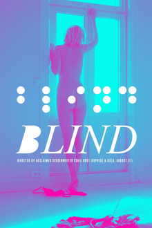
Blind (Eskil Vogt, Norway, 2014)


Luton wont win, though. Not with Blind in the competition. Blind seems like the perfect winner: It's a crowdpleaser, it has visual style - though not enough to be off-putting to anyone - and it has name-recognition. Eskil Vogt used to work with his more famous compatriot Joachim Trier, who's film I've yet to see. But who has quite a name, very much so in Denmark. The cinema was completely packed, as far as I could see.

We got to see a very fine and inventive film. Ingrid is a writer, who has turned blind. She spends her days in her appartment, afraid to go out - in a frightening black scene with a cacophony of street-sounds over it, we feel what she's afraid of. Instead, she invents a story with a love-triangle, between Einar, a loner with a porn-addiction, Elin, a divorced mother from Sweden, and Ingrid's own husband, Morten. The film cuts back and forth between those two stories, sometimes in the same scene, as we switch from the real world to the world Ingrid imagines. Ingrid does a sexy little striptease in front of Morten, and he seems really aroused, but then we hear clicking-sounds and we realize he has been writing on a computer the whole time. All of a sudden, there is a computer in the scene. Dejected, Ingrid goes to sleep, and then we see that Morten actually is chatting with Elin! Obviously, we're back inside the head of Ingrid.


The whole film is full of inventive stuff like this. As such, it becomes a really visual film. What could have been a boring shot-reverse-shot scene between Einar and Morten is enlivened by Ingrid's voiceover, as well as her inability to decide whether it takes place in a café or on a bus. There is an absolutely brilliant sequence a short way into the film, depicting the development of Einar's porn-addiction, which means this film has more naked people in it than most films I've seen. And also, while that set-up could have let to something really boring and moralistic, it's pretty nuanced. Watching fetish-porn makes him learn stuff about himself. Watching 'natural' girls means that he can't stop imagining what all the woman on the street looks like while masturbating. But this sequence is eclipsed by another one later on, dealing with the aftermath of Utøya. Just devastating, and the point at the end - that everyone was now a bit scared of reclusive men like Einar - is really tough to take.

This is a small but smart film. It can both lambast Morten for being afraid to make a funny racist joke, while still making sure to point out later on the joke was factually wrong. It has a great script, great acting, and a fine visual style. I did not like the conclusion, though, which seemed a bit bland in it's epiphanies. Until then it was a lark, and the actual final scenes were once again daring and fun. I'll put my money on this to win, even though I'm probably more a fan of the formalism in Luton.

tirsdag den 8. april 2014

CPHPIX day 5: A Touch of Sin, Bastards, Real

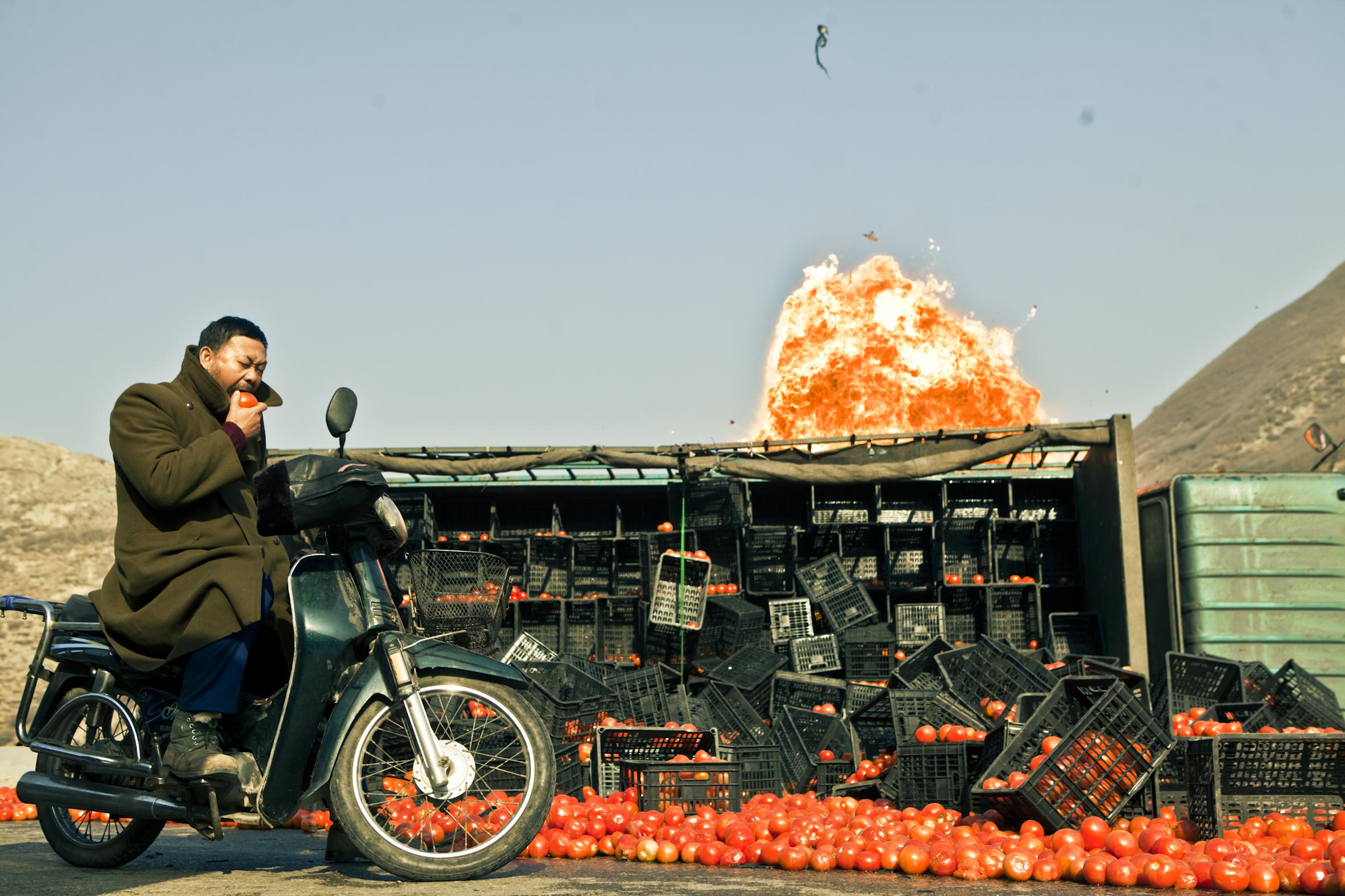
A Touch of Sin (Jia Zhangke, China, 2013)


There is a fun dynamic in the arthouse world in Denmark. A film premieres at Cannes, gets rave reviewes, wins an award. Then it takes 11 months for it to hit CPHPIX. A very long time to prepare, read reviews, analyses, watch the director's earlier filmography (though I failed to do so with Jia). Get hyped. In the end, it might be hard for the film to really hit you, and exceed your expectations. Stray Dogs managed to do so. A Touch of Sin is quite clearly the second-best film I've seen this year, but it didn't really rise above my expectations.


Four stories with violent conclusions, taken from contemporary China. Slightly intertwined. All taken from real news-stories, though they were mainly big on China's microblogging site Weibo, the unofficial way to get news. Using genretrappings to create a picture of a deceased society. In many ways, this is the perfect version of what Manuscript's Don't Burn tried to do. The cinematography is stunning, with the mobile but steady camera constantly catching amazing picture after amazing picture. It's never boring. And the film feels open, as if it has more on it's mind than just the four tragic stories it tells.

Actually, what most fascinates me right now is the insane amount of stories being told or alluded to in this film. There are Weibo-stories of corruption being discussed. There is a trainwreck catastrophy occuring all of a sudden. Tv-screens show apropiate movies - John Woo and Tsui Hark, apparantly, famous Hong Kong action directors. The characters watch snippets of Chinese Opera, based on the old Chinese novel The Water Margin, about noble characters forced into being violent outlaws. The English name of the film is an allusion to the old wuxia film A Touch of Zen, a masterpiece in it's own right. The scenography of the film manages to tell a bunch of stories as well: An oppulent car in a desolate village tells a story of inequality and corruption, grand hills of coal tells of ecological disruption.


It all adds up to a compendium of modern myths. This is a brilliant way to counter censorship: An explosion of counter-stories, showing not just a multitude of unofficial stories, but also the inability to keep those stories hidden. An overwhelming portrait of a dysfunctional country, this film should be seen by everyone interested in the world as it is today. The shut-down coal-mines, the migrant-workers, the saunas, the high-speed trains, the unsafe sweatshops creating goods for export. This film does to China what The Great Beauty did to Italy, though many times more effectively - and I liked The Great Beauty. It's a film filled with great scenes and details, like a character using three cigarettes to pray to the ghosts of the people he's killed, or a line of girls marching in a display of Red Army kitch for Cantonese visitors. The fact that it was ever slated for a mainland Chinese release is amazing, though the regime has delayed it infinitely. But it will hopefully be downloaded illegally, and discussed on Weibo. It is a great film, and very important. But I knew that, most of the people reading this probably also already knows this. And it's not more than that, I think.

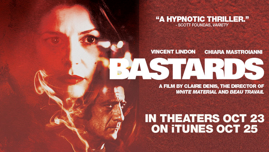
Bastards (Claire Denis, France, 2013)


I've seen this film before, on a VOD-stream. But boy did I miss a lot. One has to be careful with a Denis-film, I missed a neon-sign, and thereby a huge chunk of the plot. A woman walks toward a Tabac-sign, then it shuts down, signalling that the shop has closed. The man living in the appartment above grabs some packs of cigarettes, wraps them in his shirt, and throws them down on the street. That shirt becomes the facillitator of their flirt, and without understanding why he threw it down, it all just seemed very weird.

I like the way details add up in this kind of Denis. Shots of stuff, of faces, of bodies. And then we have to piece their meaning together. 35 Shots of Rhum did it with a story of a makeshift family of immigrants, whose relations only gradually came clear to the audience. Bastards does the same thing with a Lynchian mystery. Which does make it less interesting to me. A mystery-like style is more innovative for a family drama than for a mystery. Also, the pictures are slightly murky, and the dream-like interludes make the plot hard to follow: After the suicide of his brother-in-law and the hospitalization of his niece, Marco returns home and moves into the flat above the man he decides is responsible: The wealthy banker Laporte. Marco begins an affair with Laporte's young wife, which is depicted tenderly. But the investigation into Laporte remain unfulfilling.


A thing I noted: The title of the film is in plural (Les Salauds in French instead of Le Salaud. The true English translation would be The Bastards) So when Marco claims on Laporte: It is He who is the Bastard. He is wrong. At other times he seems to recognize this, he claims to have been happy he's divorced, so that his daughters won't be 'infected' by what was wrong with his sisters family. Notably, that infection would have to run through himself. I've seen commenters talking about this as a film attacking the wealthy privilege of Laporte, but I don't see it. I see it more as a feminist tale. A short clip of a naked woman lying on the street in Paris seems to bear this out. In this way, Marco becomes one of the Bastards as well: He continues to want to dominate in his affair and tells her what to think and do, and never listens to what she says. He is using her to get at Laporte, and Laporte is actually quite right when he takes his young son away from the influence of a man he decides is dangerous. In the end, people will die, tough secrets will come to the surface, and a woman will make a choice and take action. And the young son will probably be traumatized.

I think Denis belongs in any discussion of the best directors working today. Beau Travail is a massive masterpiece. Friday Night is slight, but creates a fantastic world for it's characters. 35 Shots of Rhum and White Material are great as well. This one is lesser. The filmmaking is exquisite, though murky and hard to grasp. But the themes don't really add up, I don't think. It becomes slightly facile.

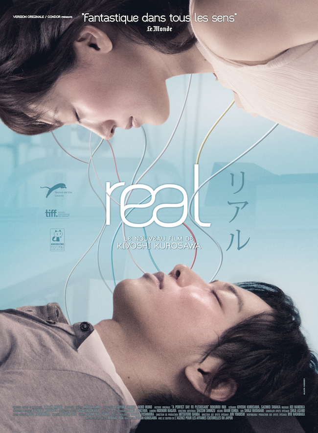
Real (Kiyoshi Kurosawa, Japan, 2013)


Kiyoshi Kurosawa is really productive these years. Last year I saw his Penance at PIX, a 2012 tv-series turned into 4-hour film. And after Real, he managed to get yet another film into theaters in 2013, which we might get to see in 2015? And this is coming after him not having made a feature since Tokyo Sonata in 2008. I kinda liked Penance, though it had it's flaws. It was uneven visually and overlong and -plotted, but I just decided that was probably due to it being a tv-series, and focused on the highpoints and it's thematic richness. But Real is a feature film, and it has all the same problems. Apparantly, this might be a new 'style', and if so, them I'm probably not going to prioritize catching the next thing he does.

Kiyoshi Kurosawa got famous for doing J-horror to begin with, and though this isn't a horror-film, his chops are in great use. The plot revolves around a machine allowing people to do something called 'Sensing', entering the mind of a comatose patient, and trying to convince them to wake up. The young man Koichi is trying to wake up his girlfriend Atsumi, a manga-artist who tried to commit suicide. The brilliant twist is that the stress from use of the machine causes people to hallucinate, even when they are out of it. So you have an Inception-like dream-world, where everything can happen. And then you have the real world, except it's full of hallucinations. So everything can happen. There's some great stuff with this, scenes looking like they are drawn, off-kilter photography, and tropes taken from the horror-playbook. Except that it quite explicitly is just all in the head, and everyone knows this. But then the twists starts coming, and boy... I don't want to ruin the experience but I feel like I need to say this: People in the theater was howling with laughter at the stupid twists, and then groaning once another twist meant the film had more story to tell.


That was insane. I don't know what on earth Kurosawa was thinking, but there are things in this film which is quite clearly the dumbest, ugliest, most ridiculous stuff I've seen at this festival. It might not be Kurosawa's fault, the film is based on a book called A Perfect Day for Plesiosaur, so the dumb plot might be a consequence of adapting the book too faithfully. That the visual side is so unapealing, that is on Kurosawa, though. It might be a question of taste, but I strongly dislike the aesthetic of his last few films. Tokyo Sonata is amazing - and the only earlier of his I've seen - so I don't get why this looks like it does. But it's way too digital and sleek, with modern appartments in steel and glass looking way too impersonal, and the colours being way too cold. And the music is just horrible, all the way through.

This is baffling. Half a fun but flawed psychological horror/sci-fi-hybrid, and half completely ridiculous... yeah, I don't know how to describe the second half. It's awful, though. Catch it for the visual trickery in the first half, but be prepared for a massive let-down.